You’ve built dashboards before—ones that looked impressive in a demo but collected dust within weeks. The problem isn’t the tool or the data; it’s that most KPI dashboards aren’t designed around how operations teams actually work. When you tie every metric to a clear owner, a defined threshold, and an explicit action plan, the dashboard stops being a report and starts driving decisions. What follows is a framework for making that shift stick.
Key Takeaways
- Limit the dashboard to five to ten KPIs mapped directly to operational goals to eliminate noise and maintain focus.
- Connect dashboards to live data sources with scheduled automatic refreshes so metrics stay current without manual effort.
- Assign a clear owner to every KPI and pair red/yellow/green thresholds with documented playbooks for immediate action.
- Design a three-tier layout—headline KPIs, trend lines, and drill-down tables—following the 1-3-10 second visual rule.
- Lock all KPI definitions into a governed semantic layer to prevent metric debates and ensure one source of truth.
Why Your Operations Team Needs a KPI Dashboard
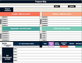
When your operations team pulls numbers from five different systems and nobody agrees on which figure is correct, you’ve already lost time before any real decision-making begins. A KPI dashboard eliminates that friction by centralizing your 5–10 most critical metrics into a single source of truth that everyone references consistently. Beyond accuracy, you gain real-time visibility with a set refresh cadence, which means you’ll catch fulfillment delays or rising ticket backlogs before they spiral. Each metric carries targets with red/yellow/green status logic and clear ownership, so accountability isn’t a conversation—it’s built into the view. You can also drill down by queue, region, or team using interactive filters instead of chasing answers through static spreadsheets and manual reports. By highlighting a concise set of Critical Performance Indicators alongside supporting KPIs, your dashboard shifts focus from generic measurement to the vital outcomes that truly define operational success.
Choose the Right KPI Dashboard Type for Your Role
Not every dashboard serves the same audience or decision-making rhythm, so before you build anything, you need to match the dashboard type to the role that’ll actually use it.
Match the dashboard to the decision-maker—because the wrong view for the wrong role helps no one.
Strategic dashboards work best for executives and senior leaders who track long-term outcomes like revenue growth, gross margin, market share, and churn—these boards typically surface a small, focused set of high-level KPIs reviewed on a monthly or quarterly basis.
Operational dashboards, on the other hand, are designed for operations and team leaders who need near-real-time visibility into day-to-day metrics such as fulfillment rate, system uptime, and ticket volume or wait times.
Tactical dashboards support mid-level managers tracking execution progress through sprint velocity, bug counts, and feature completion, helping them adjust scope when performance shifts.
To ensure each of these dashboard types actually drives action, design them so key metrics can be understood within seconds by applying visual management’s 1-3-10 second rule to how information is laid out and highlighted.
Pick 5–10 KPI Dashboard Metrics Tied to Real Goals
Because a dashboard crammed with every available metric quickly becomes noise, you’ll want to narrow your selection to five to ten KPIs that map directly to the operational goals your team actually owns—metrics like fulfillment rate, system uptime, or ticket backlog where every number has a clear owner and ties to a specific decision. For each KPI, set an explicit target and define green, yellow, and red thresholds with clear cutoffs so status is never subjective. Include at least one leading indicator such as ticket volume trend or queue aging for early detection, alongside one outcome indicator like resolved SLA rate for accountability. Lock definitions in a shared semantic layer so the team never debates which number is correct. This small, focused KPI set should be visually reinforced with simple color-coded indicators on your dashboard so the team can spot issues at a glance and act quickly.
Connect Data Sources So Your KPI Dashboard Updates Itself
Once you’ve locked in your five to ten KPIs with clear definitions and thresholds, the next step is wiring your dashboard to the systems that generate that data so numbers refresh on their own without anyone copying rows from a spreadsheet. Most modern tools offer built-in connectors—Geckoboard, for example, supports over 90 sources including ZenDesk, Google Analytics, HubSpot, Salesforce, and Shopify—so you authenticate directly and widgets pull live data automatically. Start with one metric widget, verify it’s pulling accurate numbers, then expand by adding widgets and splitting charts by owner or rep. For multi-source dashboards, connect both operational and supporting systems simultaneously. To reinforce performance management systems, ensure your dashboard mirrors the same strategic KPIs and review cadence your leadership team uses to track progress and allocate resources. If you want a low-risk test first, use Google Sheets as a lightweight connector to validate refresh behavior before switching to production integrations.
Design Your KPI Dashboard Layout for Fast Decisions
When your data sources are feeding live numbers into the dashboard, the layout you choose determines whether someone spots a problem in five seconds or wastes five minutes hunting for it.
Structure your screen in three tiers: place three to five headline KPIs across the top row, each showing its target alongside a red, yellow, or green status indicator so priority registers at a glance.
The middle section should display trend lines and forecast-versus-actual comparisons that let you judge momentum immediately.
Reserve the bottom for supporting drill-down tables, including an “at-risk top 5” list tied to threshold logic like pipeline coverage dropping below 2.5× quota.
Group these widgets by operational workflow—Intake, Processing, Fulfillment, Resolution—and position interactive filters for date range, region, and product at the top.
To sustain accountability and quick course corrections, align this dashboard with regular strategy outcome reviews so teams see the impact of their actions in real time.
Set Thresholds and Status Colors on Every KPI Dashboard Metric
Every metric on your KPI dashboard needs a defined threshold structure before it goes live, because without one, the status colors that drive fast decisions become arbitrary and, worse, misleading.
Without defined thresholds, your dashboard colors are just decoration—status indicators need structure to drive real decisions.
For each KPI, you’ll set a baseline, a green target threshold, and yellow/red bands—green at or above plan, yellow at roughly −5% to −10% versus baseline, red below that.
Use a trailing eight-week median for baseline smoothing so noisy week-to-week swings don’t trigger false alarms.
Match your status-color rule to the KPI’s intent: turn pipeline coverage red when it drops below 2.5× quota, or flag churn red after two consecutive weeks above target.
Pair every colored status with an explicit owner and a required response action, then validate thresholds year-over-year for seasonality and recalibrate after observing real outcomes.
Aligning these thresholds with your broader organizational alignment efforts ensures that KPI status colors reinforce shared goals and drive consistent, strategy-focused responses across teams.
Assign Owners and Playbooks to Each KPI Dashboard Alert
Assigning a single named owner to every KPI on your dashboard transforms a color-coded status from a passive signal into an accountability trigger, because without a specific person responsible for each metric, yellow and red alerts sit unaddressed while the team assumes someone else is handling them. This clear ownership reinforces a culture of accountability and continuous feedback that keeps strategy and execution tightly aligned as conditions change.
Once you’ve assigned owners, pair each alert with a documented playbook so the response is immediate and consistent:
- Define explicit thresholds that activate the playbook, such as “pipeline coverage drops below 2.5× quota” or “churn exceeds target for two consecutive weeks,” so the owner knows exactly when to act.
- Make each playbook actionable by specifying the next step, like “surface the top five at-risk deals and schedule review.”
- Store all KPI definitions and alert logic in a governed metrics layer so owners trigger playbooks from one single source of truth.
Keep Your KPI Dashboard Accurate With Ongoing Governance
Because a KPI dashboard is only as trustworthy as the data behind it, you need ongoing governance to prevent metric definitions from drifting, refresh schedules from lapsing, and permissions from loosening over time.
Lock KPI definitions—name, formula, filters, and unit of measure—into a centralized semantic layer so terms like “Revenue” or “Churn” stay consistent across every team and dashboard.
Require automated ingestion with a scheduled refresh cadence, such as “accurate as of 9:00 AM Monday,” to eliminate manual spreadsheet errors.
Enforce security at the data layer so each viewer sees only approved numbers.
Use governed connectors and standardized transformation logic upstream to prevent conflicting counts, and pair every KPI with an owner, target, and red/yellow/green thresholds so stale metrics surface immediately. Visual management principles like real-time feedback and clear visual indicators can further improve trust by making data quality issues and status changes immediately visible to the team.
Frequently Asked Questions
How Do You Build a KPI Dashboard?
You’ll start by identifying your audience and selecting 5–10 metrics with clear owners, targets, and red/yellow/green thresholds.
Connect each KPI to automated data sources so the dashboard refreshes reliably without manual exports.
Define every metric in a centralized metrics layer to prevent conflicting numbers across teams, and include contextual comparisons like prior-period benchmarks to make trends immediately meaningful at a glance.
What Is the Purpose of a KPI Dashboard?
A KPI dashboard’s purpose is to give your operations team a single-screen, real-time view of the metrics that matter most, so they can spot problems and make decisions without waiting for end-of-week reports.
It pairs each metric with targets, ownership, and color-coded status indicators, which means you’ll immediately know whether performance is on track or requires intervention.
Conclusion
Think of your KPI dashboard as a lighthouse—without a clear beam, your crew navigates blind. You’ve now built that beam by selecting focused metrics, connecting live data, setting visual thresholds, and assigning owners with actionable playbooks. If you maintain governance and treat the dashboard as a living system rather than a static report, you’ll guide your operations team toward decisions grounded in truth, not guesswork.