Your OEE dashboard probably shows a comfortable number somewhere between 65 and 85 percent, and you’ve likely accepted it as proof that operations are running well. But that single average is hiding repeated micro-stops, gradual slowdowns, and quality losses that never individually trigger alarm bells yet collectively drain throughput week after week. The real problem isn’t the math—it’s what disappears when you compress volatile, shift-level reality into one tidy figure.
Key Takeaways
- Averaging OEE over weekly or monthly windows flattens recurring disruptions until they disappear from leadership view.
- Root-cause evidence spans multiple systems and fades quickly, turning diagnosis into a slow, reactive exercise.
- Recurring jams can persist for days without surfacing on dashboards, silently eroding throughput before anyone intervenes.
- Exception-driven monitoring replaces chart scanning by flagging only threshold breaches with built-in context and derivations.
- Watch micro-stoppage frequency, run-speed distributions, and defect mix by shift instead of trusting single summary percentages.
How OEE Dashboards Hide Problems Behind Clean Averages
OEE dashboards deceive you by design. When you multiply Availability × Performance × Quality and average the result over weekly or monthly windows, recurring disruptions disappear into the math.
A jam that shuts down a single line for three days won’t move a monthly average enough to trigger your attention, yet it materially depresses throughput every time it returns.
Your dashboard may show a line as “running” while the shop floor tells a different story of micro-stops and repeated jams.
Your dashboard says the line is running. The shop floor says otherwise. Believe the floor.
Static chart views reward trend-scanning, but edge-case losses hide beneath normal behavior because nothing flags them as anomalies.
Without segmenting performance and quality data by incident window, you’ll miss how one specific constraint drives defects and slowdowns repeatedly.
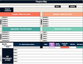
Using a Balanced Scorecard with incident-level metrics makes those recurring losses visible before clean averages mislead leadership.
Why Getting OEE Root-Cause Answers Takes Days
Even when your dashboard flags a throughput drop, getting to the actual root cause typically takes days because the data you need doesn’t live in one place.
The answers are scattered across multiple systems, and pulling them together requires effort that compounds delay at every step.
- Your SCADA, MES, maintenance tickets, and shift reports each hold a piece of the puzzle, but cross-system queries demand analyst support that’s queued behind other business requests.
- By the time an analyst is available, continued production runs can bury the original evidence—recurring jams go unlogged and disappear into later data.
- Crew-specific context fades once the shift moves on, making Tuesday-afternoon “why” questions harder to answer accurately.
- Weekly ops reviews add another latency layer, turning root-cause discovery into a purely reactive exercise.
- Leadership ends up making decisions before investigations even begin.
A visual management board can reduce this lag by making critical performance deviations visible in real time and easier for teams to discuss before context disappears.
What Delayed OEE Insights Cost Your Operations Team
Delayed OEE insights don’t just frustrate your operations team—they quietly erode output in ways that compound before anyone can intervene.
When a recurring jam persists for three days without surfacing on your dashboard, throughput drops stay invisible until after the shift ends, and leaders are left waiting for retroactive explanations that arrive too late to prevent further losses.
Weekly ops reviews add another layer of latency—a Tuesday afternoon dip may go unanswered because downtime logging wasn’t captured, and subsequent production runs bury the signal entirely.
Meanwhile, static dashboard averages mask small performance degradations and edge cases, so your team only recognizes patterns after they’ve already cost you measurable output.
Each delay gives the real root cause more time to compound unchecked.
Using visual indicators for real-time feedback can surface inefficiencies sooner and help teams respond before losses escalate.
Exception-Driven OEE Monitoring Replaces Chart Scanning
Instead of scanning line charts for hidden dips, exception-driven OEE monitoring flips the workflow—it surfaces only the threshold breaches that demand your attention, whether that’s an unusual availability loss, an abnormal performance dip, or a quality drop spike that wouldn’t register on a clean-looking rollup.
Each surfaced exception includes derivations—likely causes and relevant context—so you’re not hunting across SCADA, MES, and maintenance timelines to piece together what happened.
Built around the 1-3-10 second rule, this approach makes abnormal conditions immediately visible, clarifies the issue fast, and points teams toward the required response without delay.
- Recurring jams that average-based dashboards mask across shifts get flagged immediately
- Insights reach you in under ten seconds during current operations, not after a post-shift analyst review
- Derivations attach context directly to each exception, eliminating manual root-cause hunting
- Irrelevant noise drops out, so your review centers strictly on what requires action
- Multi-day patterns surface before subsequent production runs bury the evidence
How Ops Leaders Get OEE Answers in Seconds, Not Days
How quickly can you move from question to answer when throughput drops unexpectedly on a Tuesday afternoon?
Traditional workflows force you to submit a data request spanning SCADA, MES, and maintenance ticket systems, then wait days while analysts manually correlate sources—by which point the shift has long moved on.
Conversational intelligence layers, like Databricks Genie, let you ask plain-language questions and receive OEE breakdowns by line for the last 30 days in seconds, cross-referenced against planned maintenance windows to explain deviations immediately.
You’re no longer scanning charts or waiting in analyst queues; you’re getting action-oriented context—what changed, where it changed, and what likely caused it—in under ten seconds, which means decisions happen while they still matter.
This speed is most valuable when paired with continuous monitoring so leaders can track progress, adapt quickly, and turn insight into execution.
OEE Signals Worth Watching Instead of Summary Averages
Why does a dashboard showing 82% OEE feel reassuring when, beneath that single number, one line is bleeding Availability through recurring 12-minute jams every shift and another is running 15% below rated speed for hours at a stretch?
Summary averages hide exactly these patterns, so you need to watch signals that expose the real losses:
A single OEE number can mask the very losses it was designed to reveal.
- Frequency of micro-stoppages and downtime recurrence windows rather than mean Availability percentage
- Run-speed distribution (p10/p50/p90) and time-in-state at reduced rates to catch chronic speed loss
- Defect type mix and first-pass yield by shift instead of a single Quality percentage
- Spike detection around maintenance windows or process changes that averages absorb
- Downtime classification completeness to confirm whether logged categories actually account for all lost minutes
This matters because strategic alignment depends on exposing operational reality early, not letting summary metrics conceal execution failures.
Frequently Asked Questions
What Is the Main Benefit of Using a Dashboard for Monitoring Operational Activities?
You get speed of awareness—a single screen that consolidates Availability, Performance, and Quality into one summarized view so you can spot when OEE drifts from expected levels without waiting for manual investigation or shift reports.
It lets you align attention on machine health quickly, but you should treat it as a starting point that prompts follow-up rather than a final source of truth, since aggregated metrics can mask small but high-impact exceptions.
What Is a Performance Monitoring Dashboard?
A performance monitoring dashboard is an operational tool you use to track how fast your equipment runs compared to its theoretical maximum by pulling in signals like run speed, cycle time, and throughput rate.
It breaks performance into time-bound views—shift, day, or week—and by asset or line, so you can pinpoint where speed degradation’s occurring even when equipment isn’t technically down.
Conclusion
It’s ironic that the tool you built to reveal problems has become the thing concealing them, because a green OEE number averaging away dozens of micro-stops gives you confidence precisely when you should feel concern. You’ll get more value by watching exception triggers, analyzing downtime recurrence patterns, and tracking speed distributions by shift—signals that surface problems while you can still act on them affordably.